I have been trying to utilize MNE-Python for source localization. I have .HDF5 files on 64 channel shoulder data that I am using. I first turn those .HDF5 files into .xlsx files, and then I use that as my raw data to find the source localization. I am having issues, however, as none of my results have been matching what they are supposed to match i.e. my results show the source on the wrong hemisphere or in the wrong place. I couldn’t find the specific issue with my data. I am preprocessing with a high and low pass of 1Hz and 40Hz, and I am using AutoReject to reject bad epochs. Please let me know if you need any more information.

The following is the code I use to generate the freesurfer image:
#Calls freesurfer software to create the 3D image
fs_dir = fetch_fsaverage(verbose=True)
subjects_dir = op.dirname(fs_dir)
subject = 'fsaverage'
trans = 'fsaverage'
src = op.join(fs_dir, 'bem', 'fsaverage-ico-5-src.fif')
bem = op.join(fs_dir, 'bem', 'fsaverage-5120-5120-5120-bem-sol.fif')

#Creates the inverse operator to be used in the inverse solution to find the source location
fwd = mne.make_forward_solution(raw.info, trans=trans, src=src,
                                bem=bem, eeg=True, mindist=5.0, n_jobs=1)
info = evoked.info
inverse_operator = mne.minimum_norm.make_inverse_operator(info, fwd, noise_cov,
                                                                            loose=0.2, depth=0.8)

# Compute inverse solution
method = "sLORETA"
# dSPM, sLORETA, eLORETA
snr = 3.
lambda2 = 1. / snr ** 2
stc = mne.minimum_norm.apply_inverse(evoked_flec, inverse_operator, lambda2,
                                     method=method, pick_ori=None)
fig = mne.viz.plot_source_estimates(stc,hemi="both",initial_time=11.816, background = "black")
plt.show(fig)

#graph of channel activity per method
plt.figure()
plt.plot(1e3 * stc.times, stc.data[::100, :].T)
plt.xlabel('time (ms)')
plt.ylabel('%s value' % method)
plt.show()
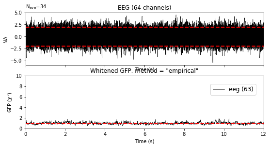
Additionally, my initial plotting of my data isn’t plotting correctly. It looks like it isn’t being turned into Hz correctly, but I believe I transposed it properly.

The code is as follows:
#File Locations
data_path = "C:\\######shouldersample.xlsx"
trigger = pd.read_excel(r'C:\######shouldervalue.xlsx')
df = pd.read_excel (r'C:\######shouldersample.xlsx')
df2 = np.transpose(df)
subjects_dir = data_path
src_fname = subjects_dir + '/fsaverage/bem/fsaverage-ico-5-src.fif'


#64 Channels used
sampling_freq = 250
channel_names = ["Fp1","FT7","C6","P2","Fpz","FC5","T8","P4","Fp2","FC3","TP7",
                 "P6","AF7","FC1","CP5","P8","AF3","FCz","CP3","PO7","AF4","FC2"
                 ,"CP1","PO3","AF8","FC4","CPz","POz","F7","FC6","CP2","PO4","F5",
                 "FT8","CP4","PO8","F3","T7","CP6","O1","F1","C5","TP8","Oz","Fz",
                 "C3","P7","O2","F2","C1","P5","F9","F4","Cz","P3","F10","F6","C2",
                 "P1","P9","F8","C4","Pz","P10"]

#Turns .xlsx files into usable arrays
times = np.linspace(0, 1, sampling_freq, endpoint=False)
data = np.array(df2)
info = mne.create_info(ch_names=channel_names, sfreq=sampling_freq, ch_types='eeg')
raw = mne.io.RawArray(data, info)

#Plots raw channel data across a given time period
raw.plot(show_scrollbars=False, show_scalebars=False, n_channels=1, remove_dc=False)
raw.plot(block=True)
Information on versions and computer:
MNE version: 0.24.1
Windows 10

