- MNE version: e.g. 0.24.0
- operating system: Windows 10
Hello everyone,
I want to integrate all subjects in each group in one graph (as the following picture) to compare the power spectral density of two groups, each groups contains 11 participants.But I don’t know how to do, anyone can help me?
微信图片_20220520124944|690x194
Hello MissDan,
I would suggest to loop over your groups and participants and calculate a PSD using welch or multitaper per participant and group and store the data in a list or numpy array. I use multitaper for estimating PSD and store the data in the format list of subjects with each subject as a an array of epochsxchannelsxfrequencies.
You can plot the PSDs for both groups using this function:
def plot_output(psda, psdb, freqs, cond_a="high", cond_b="low"):

  cond = [psda, psdb]

  labellist = [cond_a, cond_b]

  log_both = []

  for index, c in enumerate(cond):

      # log transform your data

      log = [np.log10(a) for a in c]

      #zscore

      #log = [cb - np.mean(cb, axis=0) / np.std(cb, axis=0) for cb in c]

      # mean over epochs and channels

      log_all = [np.mean(a[:, :, :], axis=(0,1)) for a in log]

      #save PSD per subject
      log_both.append(log_all)

      #mean over subjects

      log_all = np.mean(np.array(log_all), axis=0)

      high_sd = np.std(np.array(log_all), axis=0)

      plt.plot(freqs, log_all.T, label=labellist[index])

      #plot standard deviation as shaded area

      #plt.fill_between(freqs, log_all.T - high_sd, log_all.T + high_sd, alpha=0.5)

      plt.legend()

  plt.show(block=False)

  os.chdir(save_dir)

  plt.savefig("psd_mt_Fig2_confhit.svg", dpi=600, bbox_inches='tight', transparent=True)
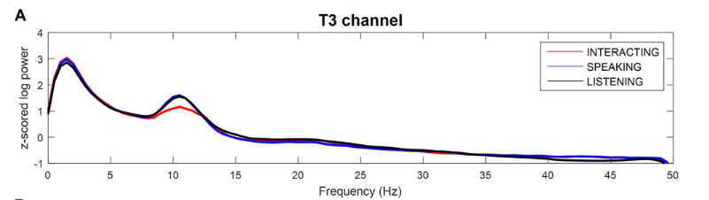
You should get a figure like this:

I hope this helps.
Carina
It works for me! Thank you very much!!!